Project | Mackenzie Health Hospital – A Service Design Challenge
Duration | January–April 2018
Project team | Emma Tsai, Heidi Soper, Christina Borota, Sarah Rombough, Anja Macakanja, Natalia Zigante
Tools | Figma, Sketch, Invision, Adobe Illustrator, Adobe Photoshop
Context
Mackenzie Health is a dynamic regional healthcare provider serving a population of more than 500,000 residents across York Region and beyond.
problem
From our research, we found a few areas that could be improved upon such as the lack of clear communication between doctors and nurses and the lack of a welcoming environment for patients.
Approach
In the hopes of discovering the needs and challenges people encountered at a hospital, we conducted qualitative research on two types of people – people who paid visits to a hospital and healthcare providers who work at a hospital. I was able to speak in depth with one person who visited the hospital for surgery. Based on the data gathered through surveys and interviews, we analyzed by creating personas as well as a customer journey map. Ultimately, our prototype ran through user testings and multiple iterations. We came up with a tablet app for healthcare providers named Communicare.
role
Everyone participated in the research phase. We designed the survey as a team, while I conducted an interview with a friend who had been to Mackenzie Health Hospital for a surgery. The team analyzed the data and compiled the Customer Journey Map together. Heidi and Me finalized the content and visual design of the Customer Journey Map, wireframes, and final prototype.
solution
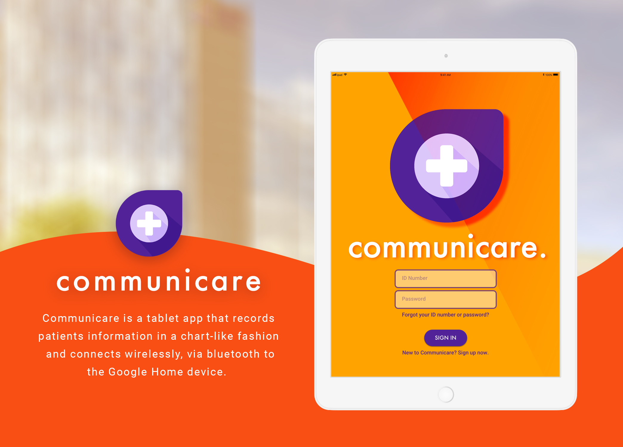
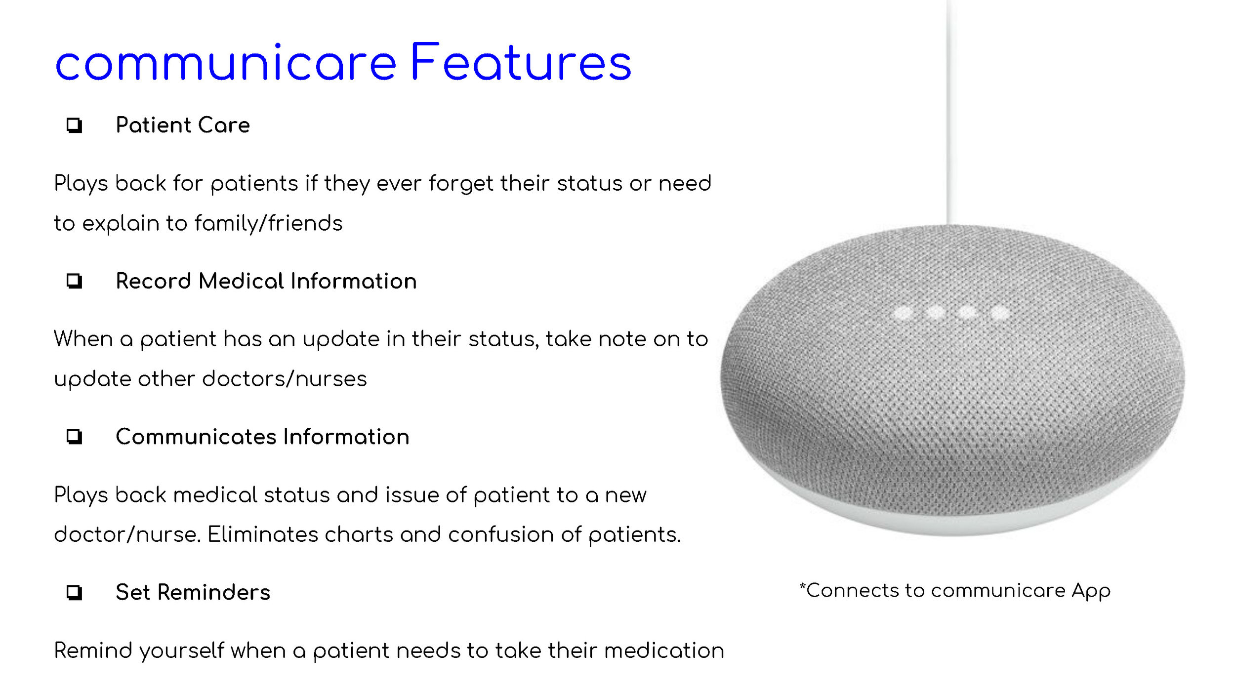
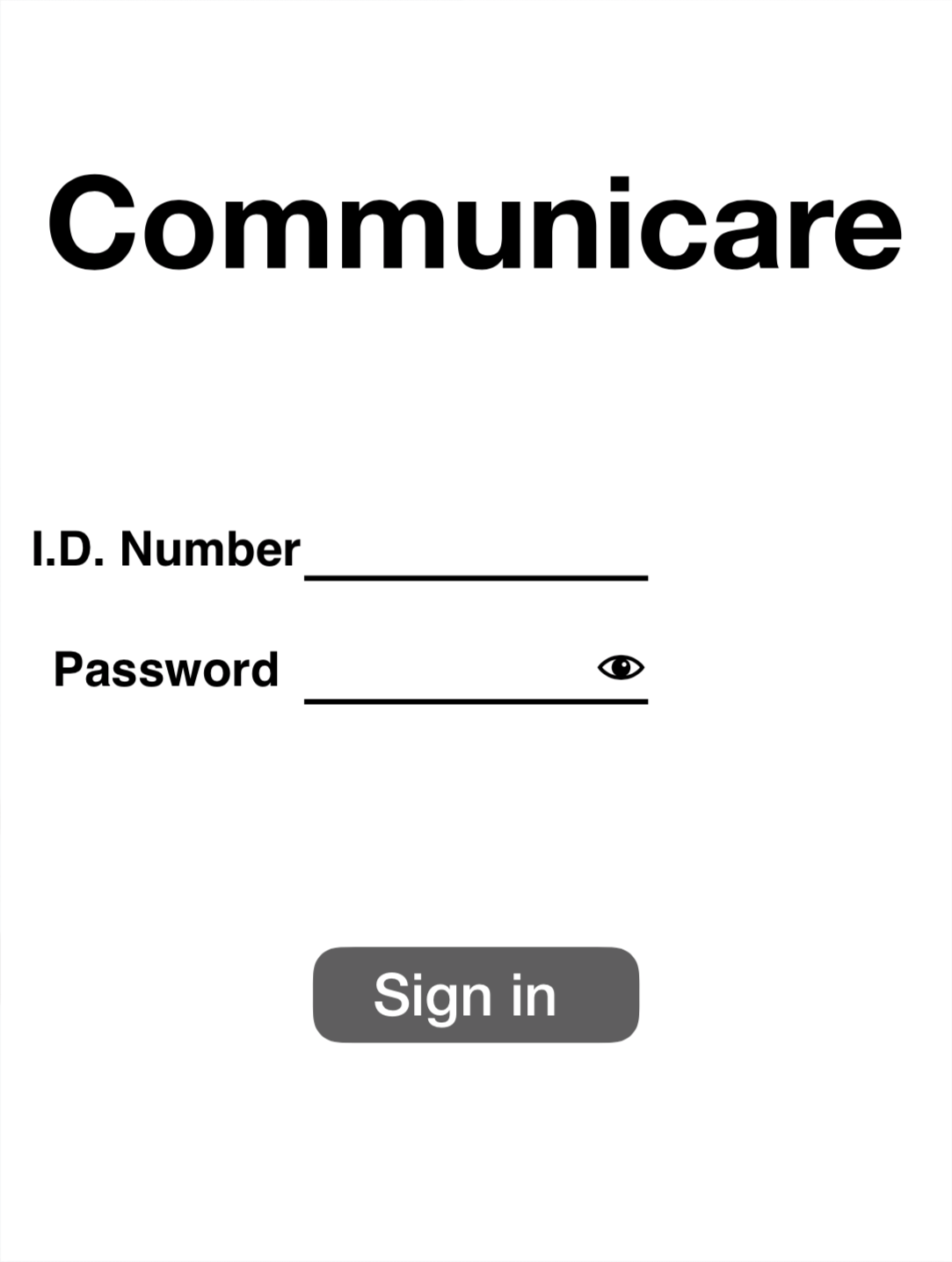
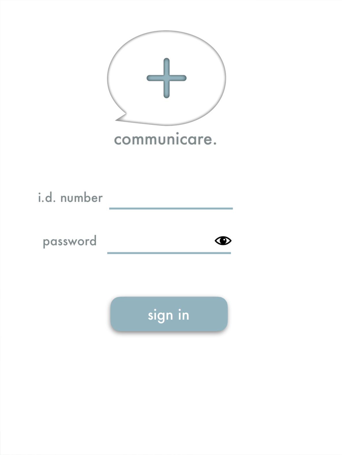
A tablet app that improves communication among healthcare professionals within the hospital by integrating google home devices to each patient's room. We are building a system that seamlessly leverages the overall patient experience by effectively addressing patient inquiries and providing updates that keep the patient informed throughout her stay in the hospital.


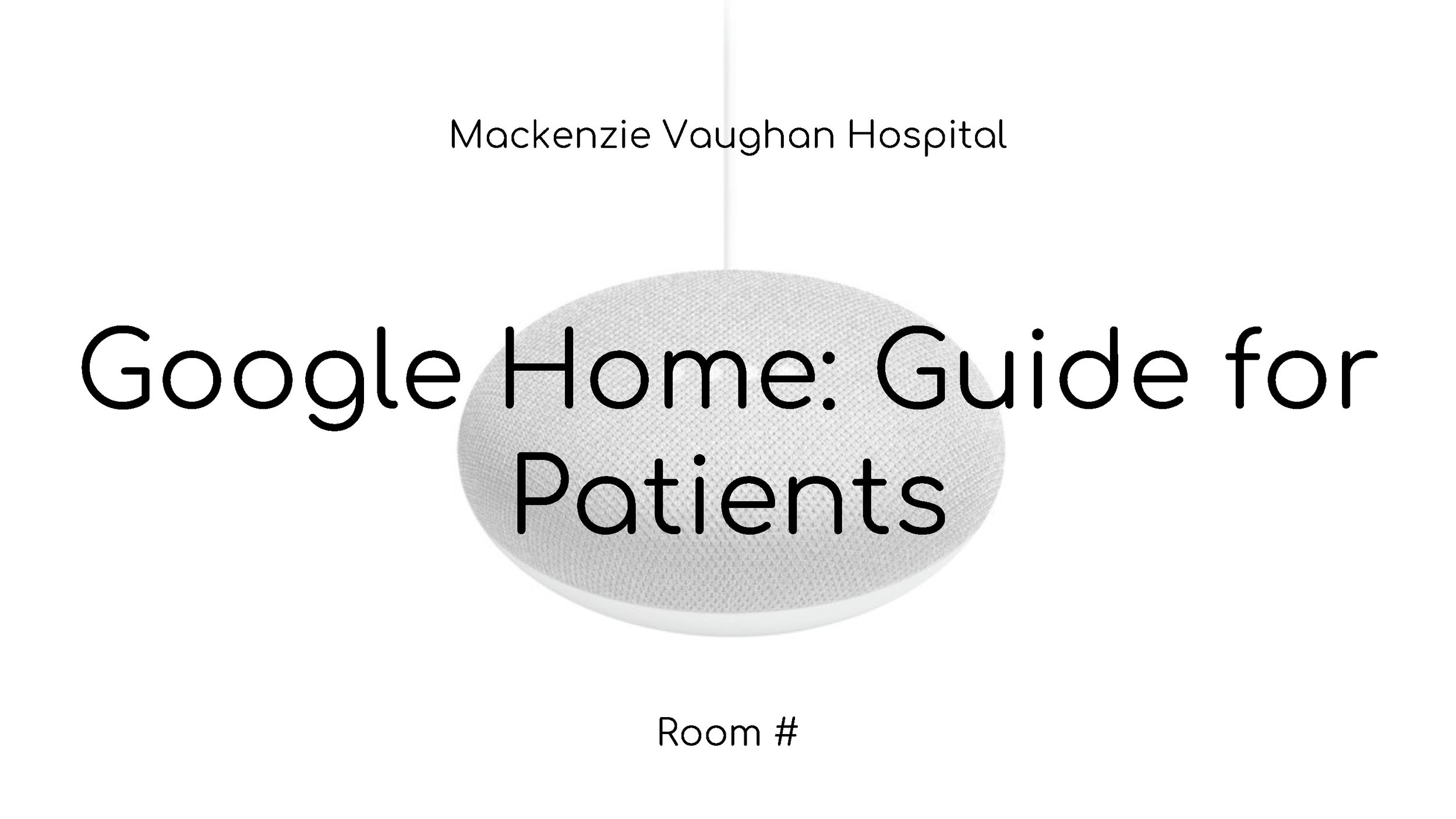
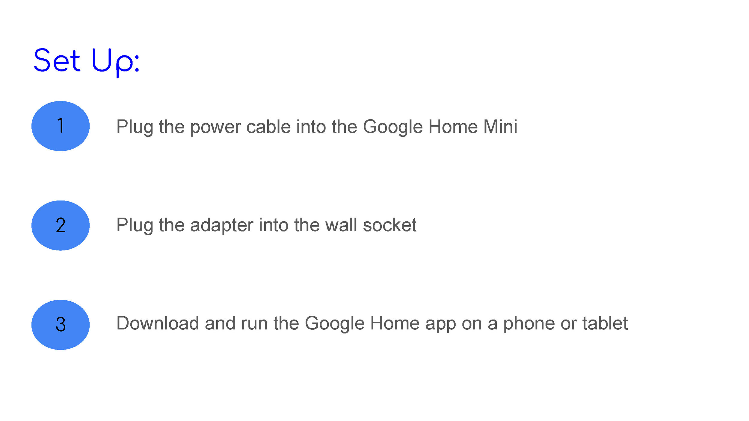
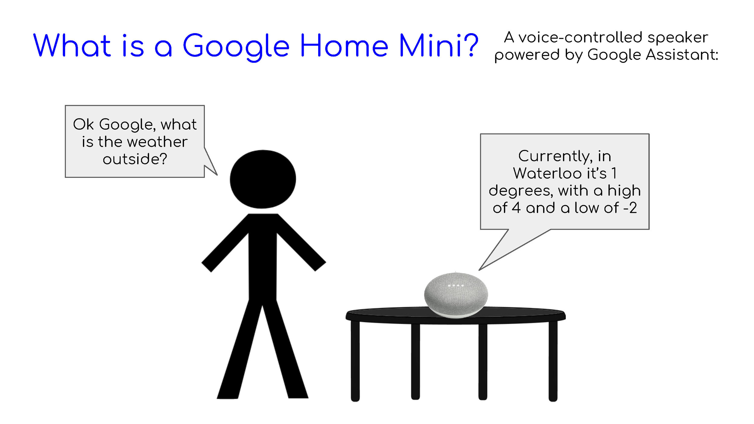
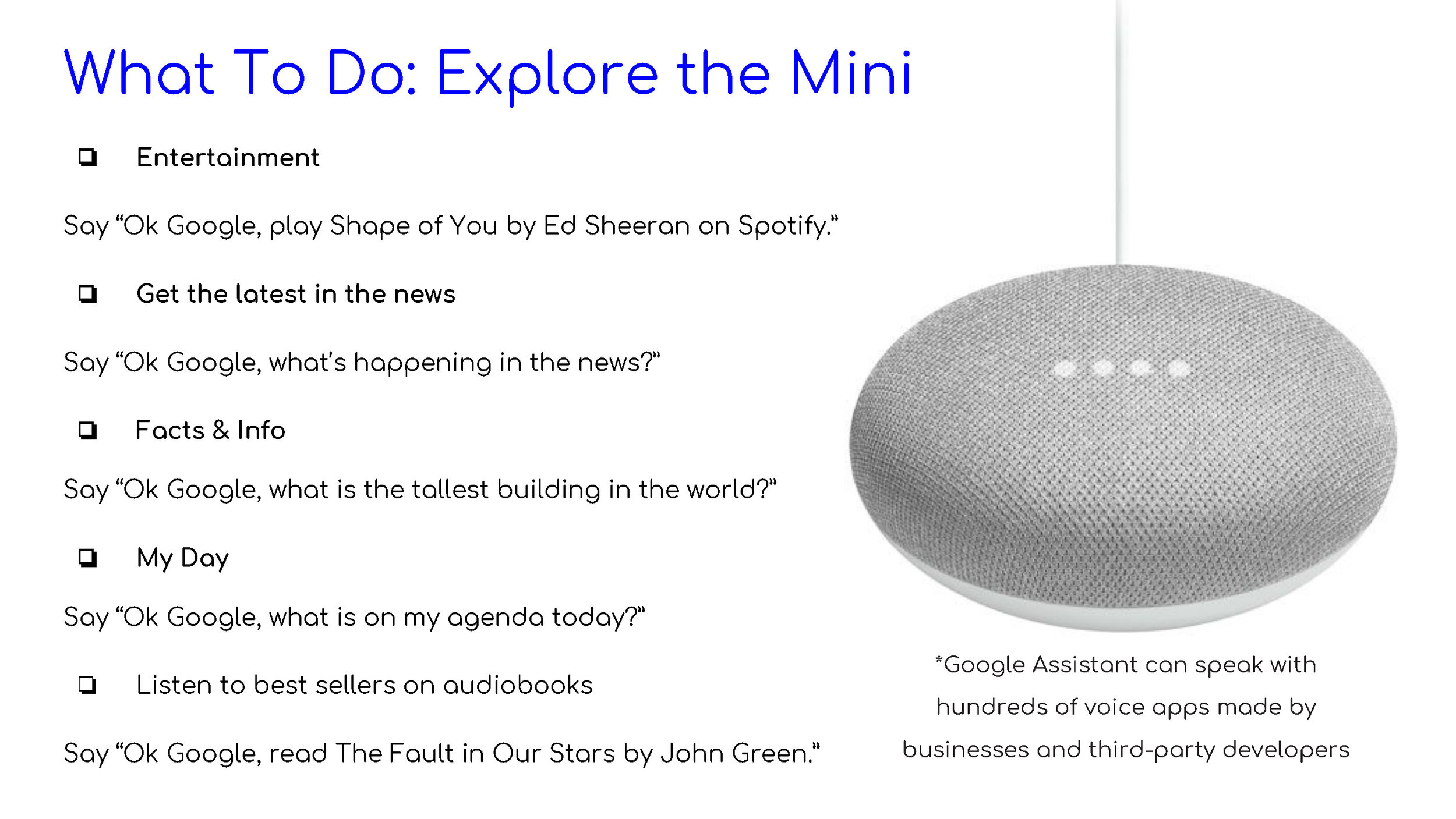
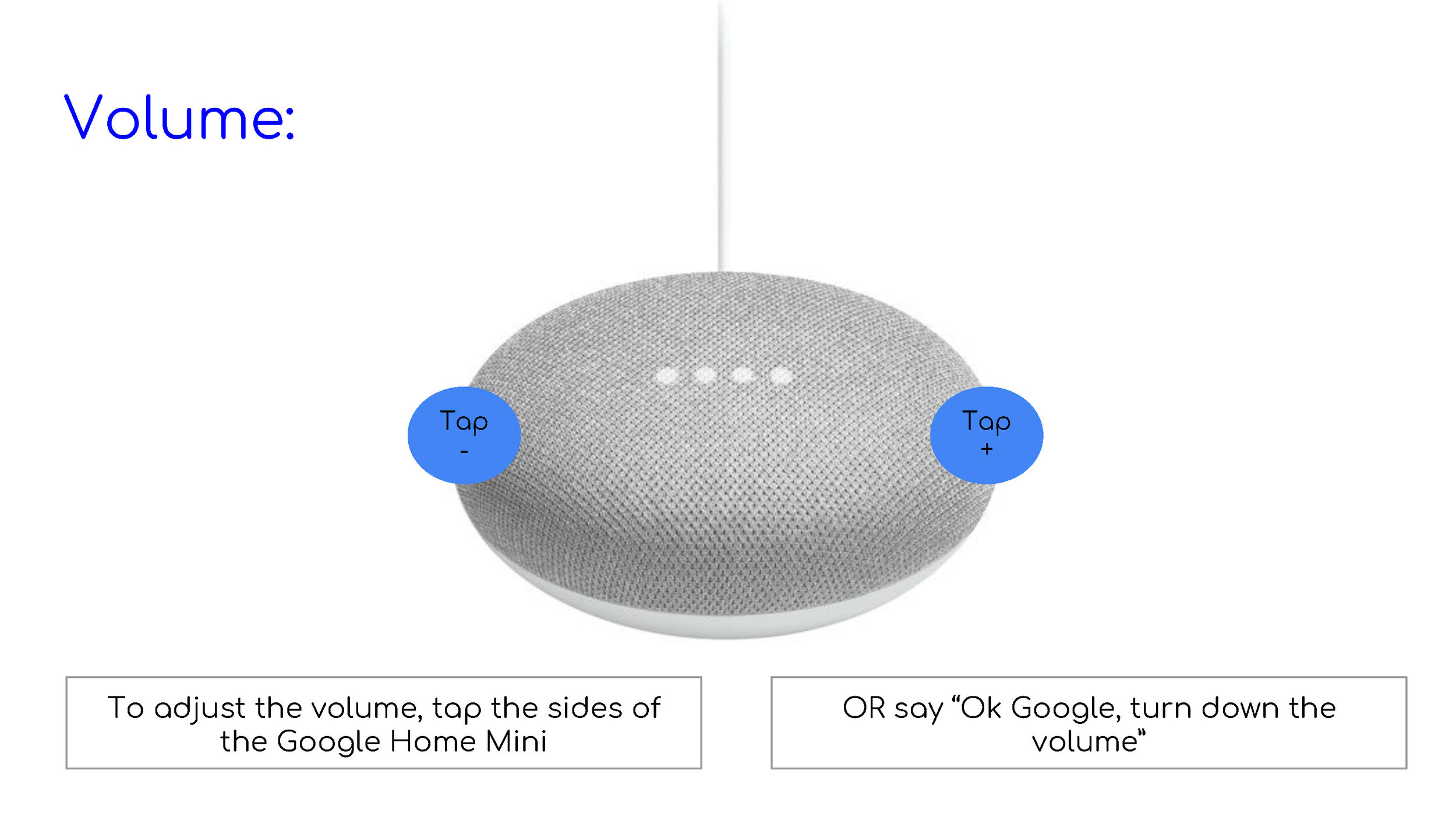
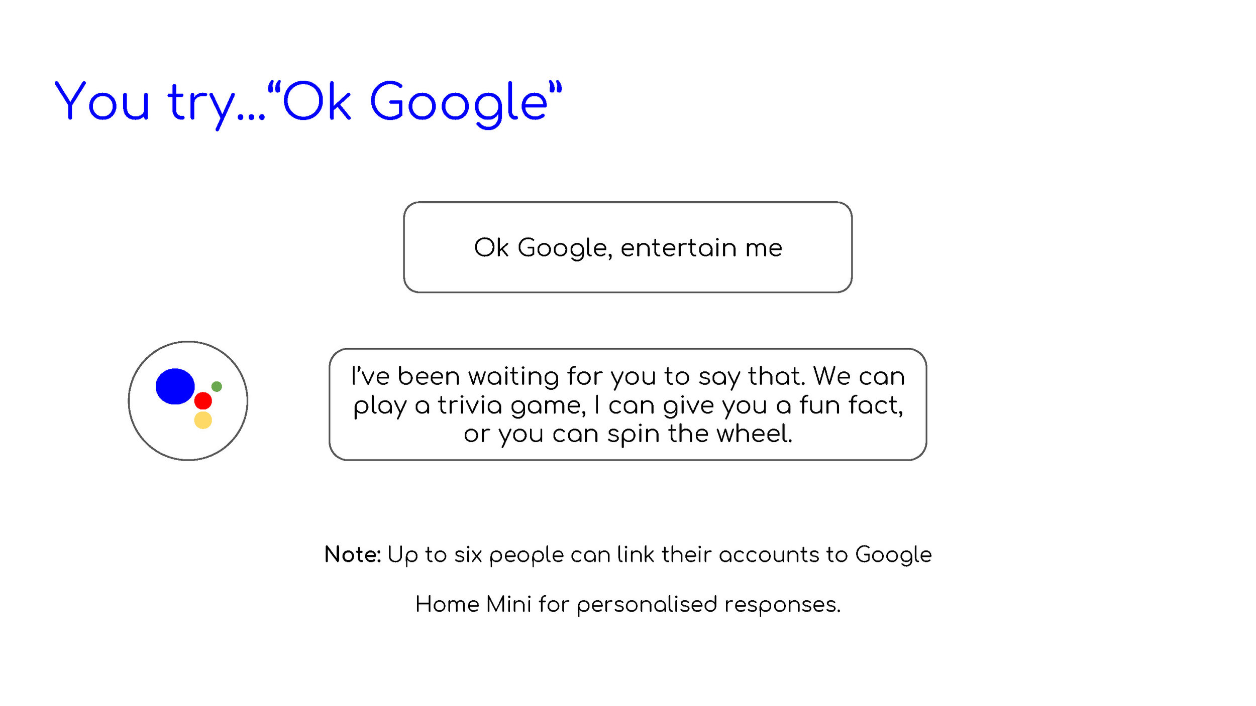
A Google Home User Guide Book for First Time Users
We devise a guidebook in hopes of helping patients to understand how Google Home works.
Research
User Stories | The combination of interview and secondary research helped me identify 3 potential users:
1. BROOKE, a registered nurse who wants to deliver a professional, patient centred, and informative communication to patients.
2. DR.JEFFREY, a doctor looking for a more collaborative healthcare communication system that leads a smoother transition of tasks among healthcare providers.
3. DARIA, a patient who wishes to have meaningful interactions with hospital staffs and a better understanding of her health conditions and medical needs.
Mapping the journey
Customer Journey Map
Using my primary and secondary research, we created a customer journey map to map out the pain points and opportunities that can be useful for ideation.
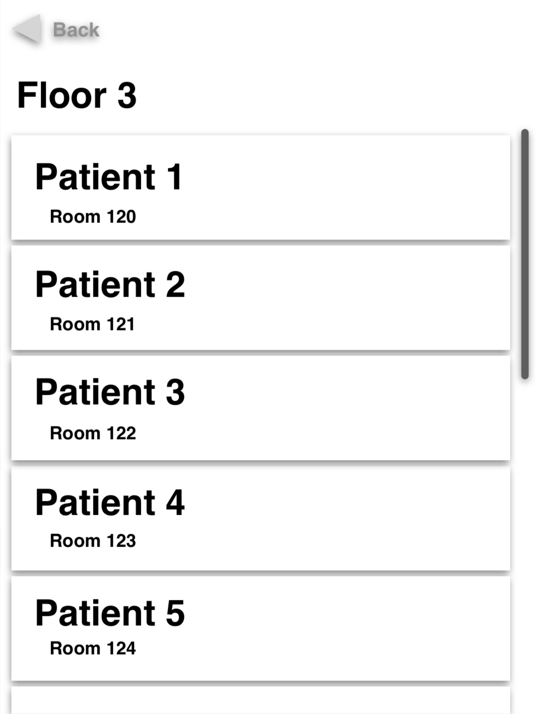
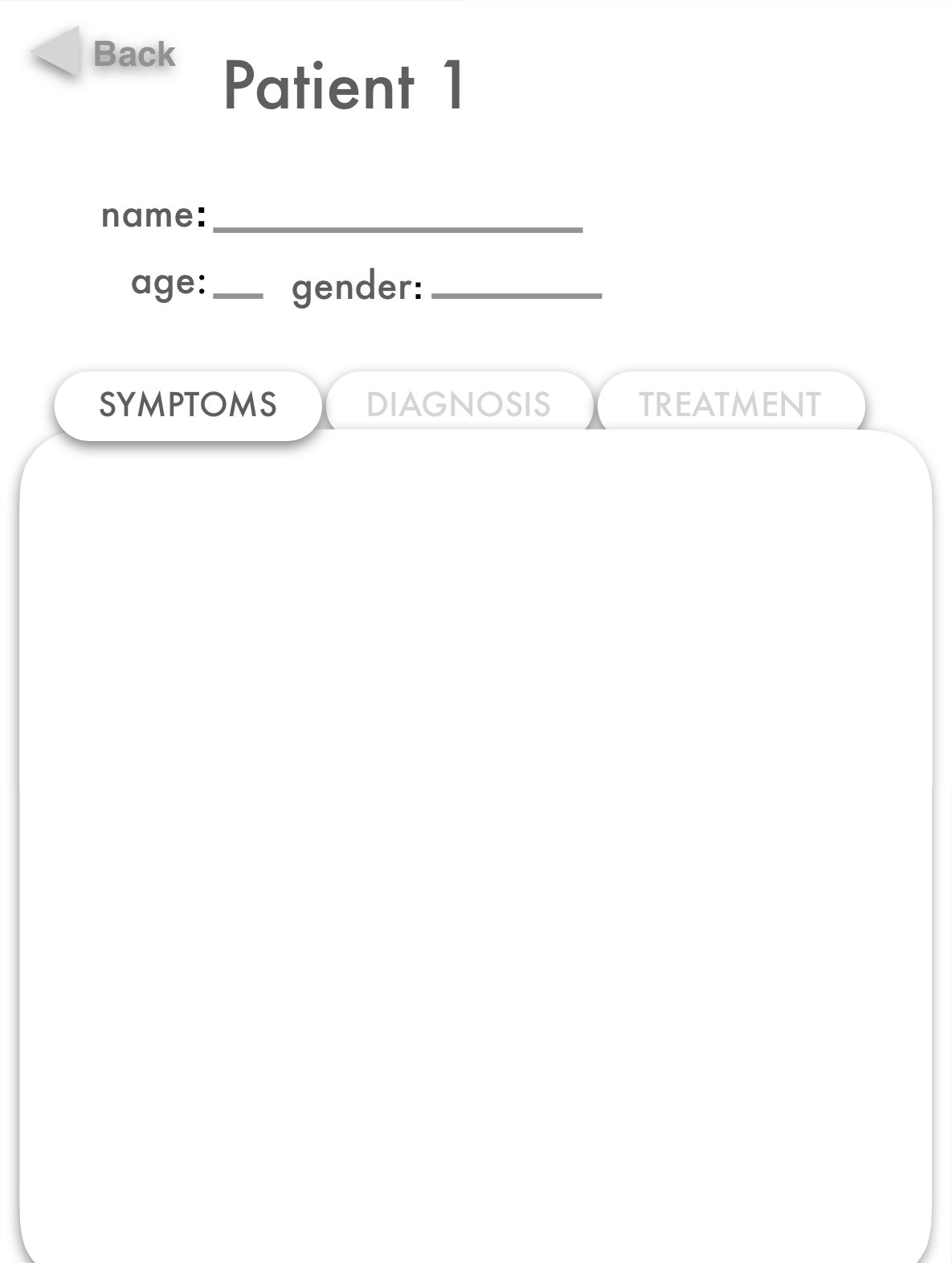
User Flow |Devising a sitemap that helps me design a fluid and intuitive way of navigating the app's content.
Design phase
Wireframe Development
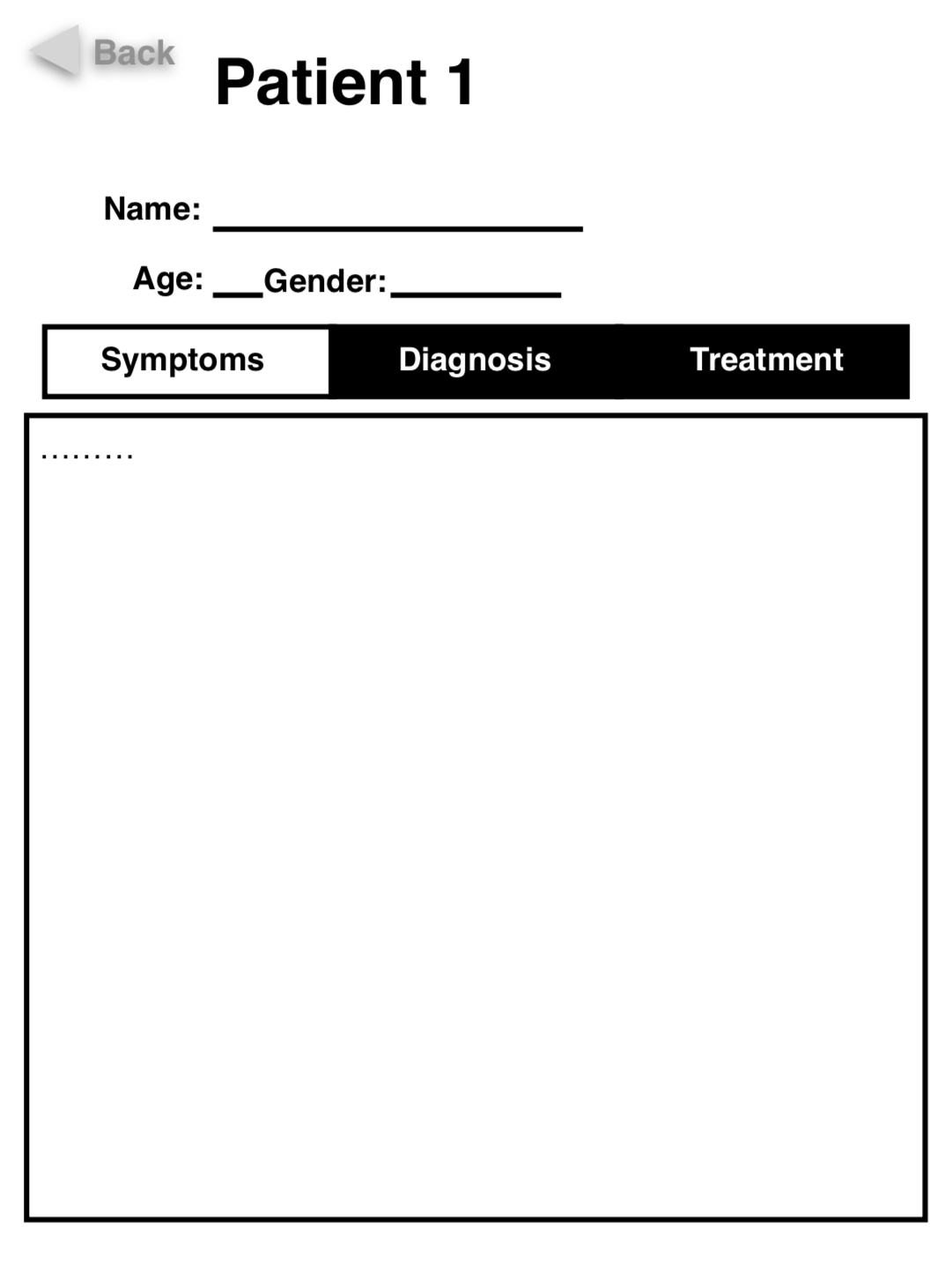
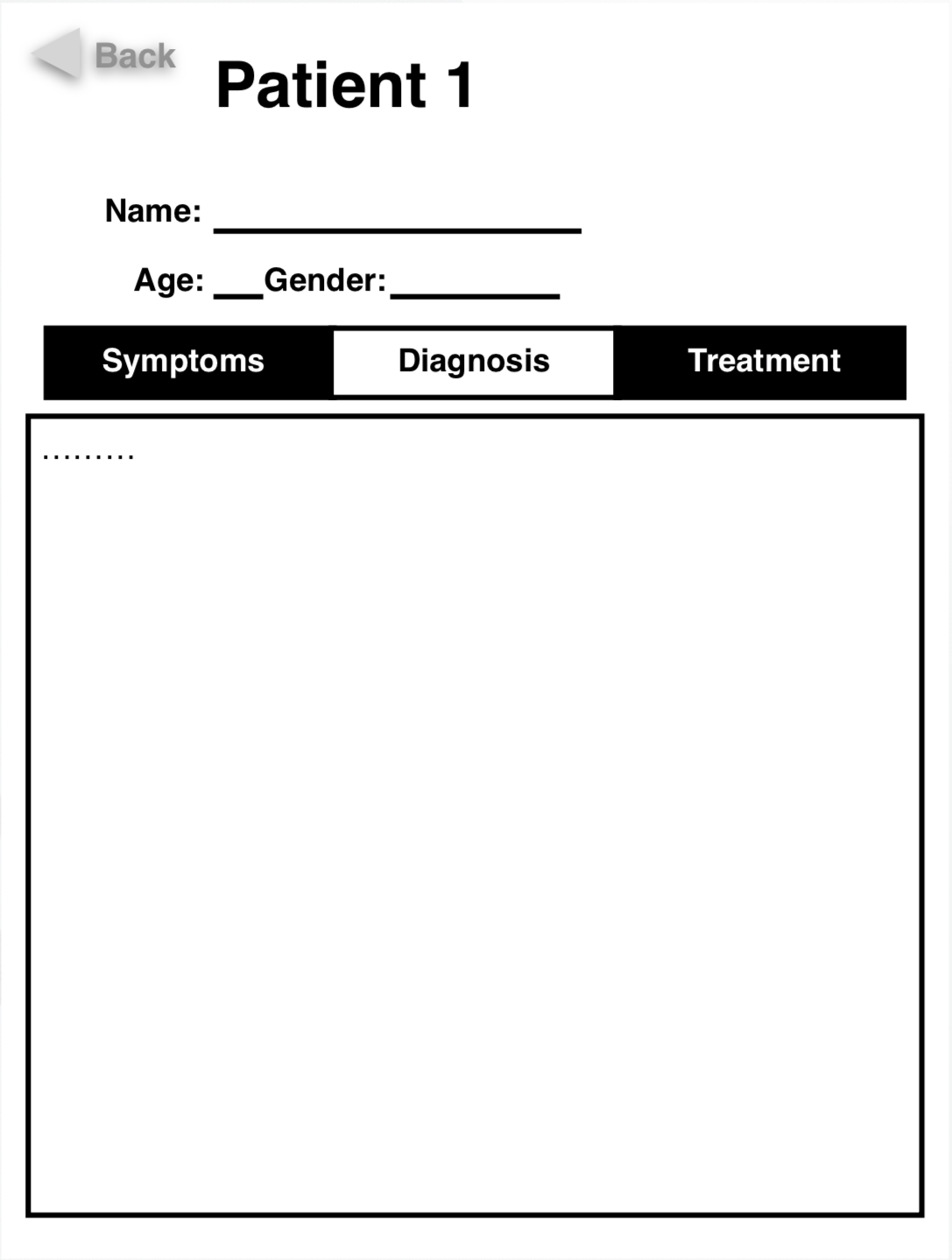
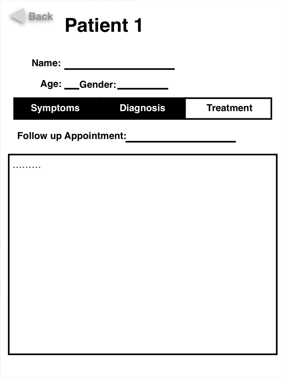
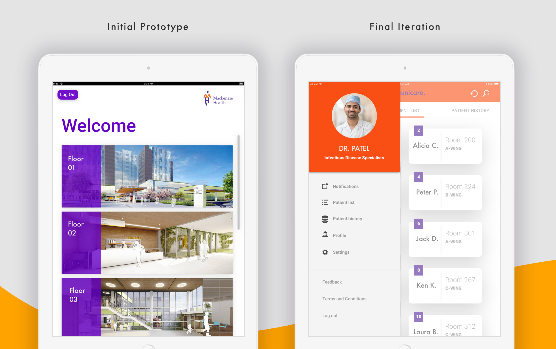
Initial Prototype Development
Usability testing
We created a Google Home guidebook for patients and we used Figma to create an interactive app prototype for user testing. We tested 5 different users, which helps us uncover things that are unclear and confusing.
Feedback and Iterations
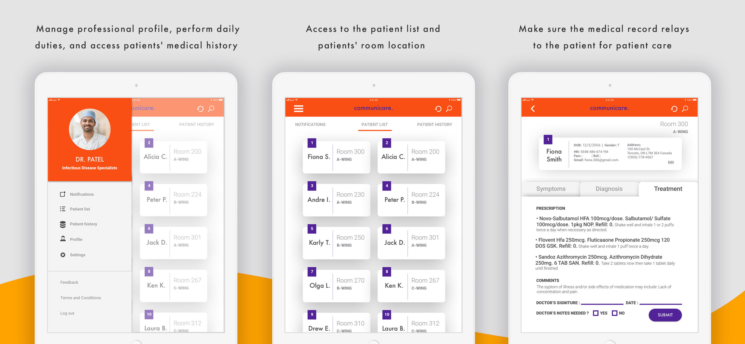
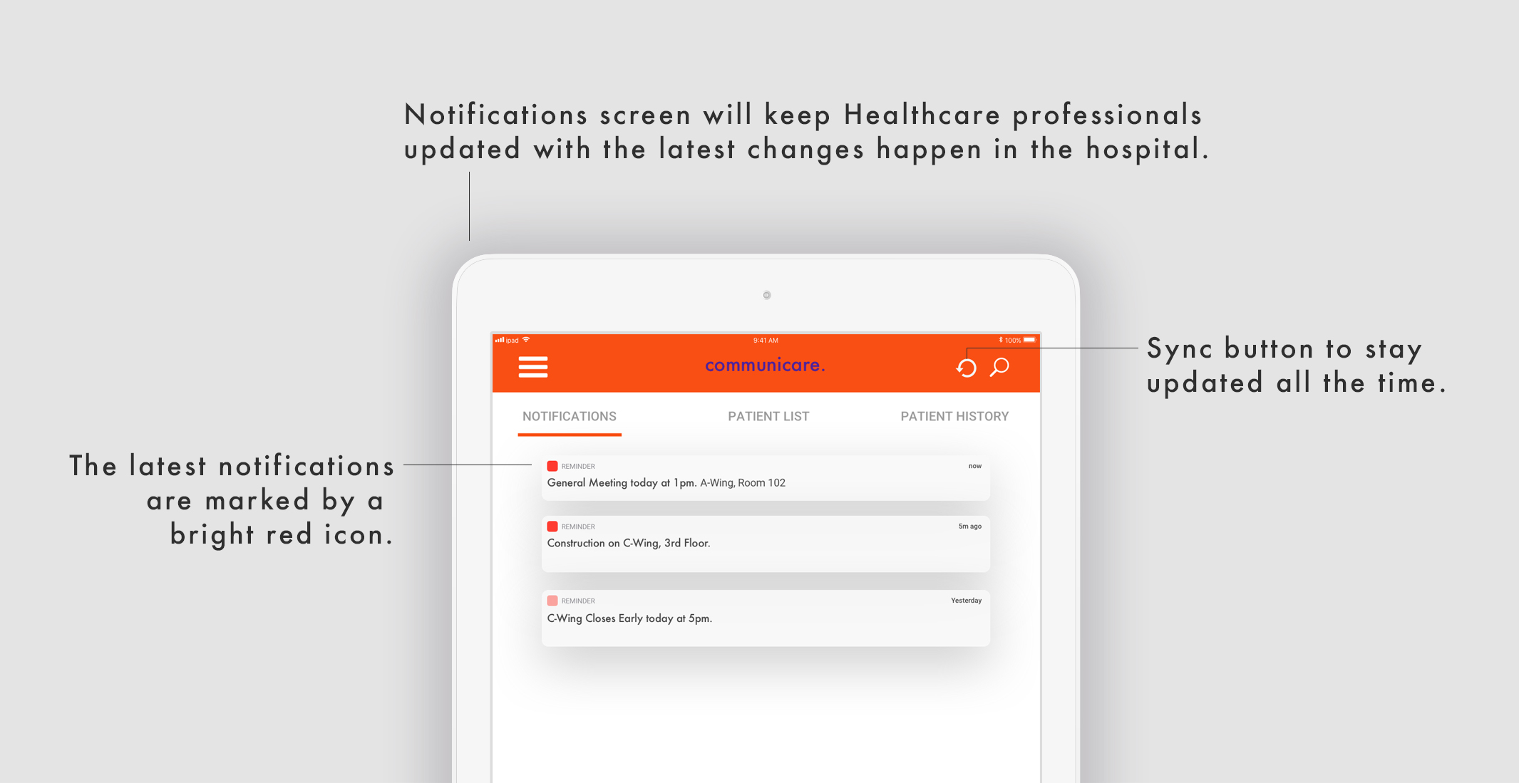
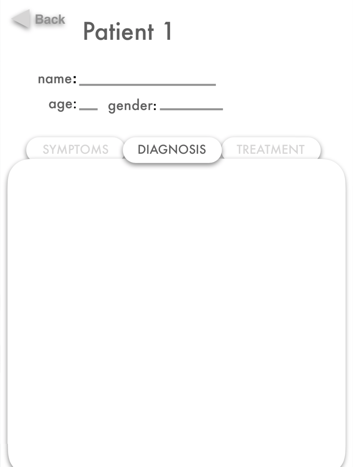
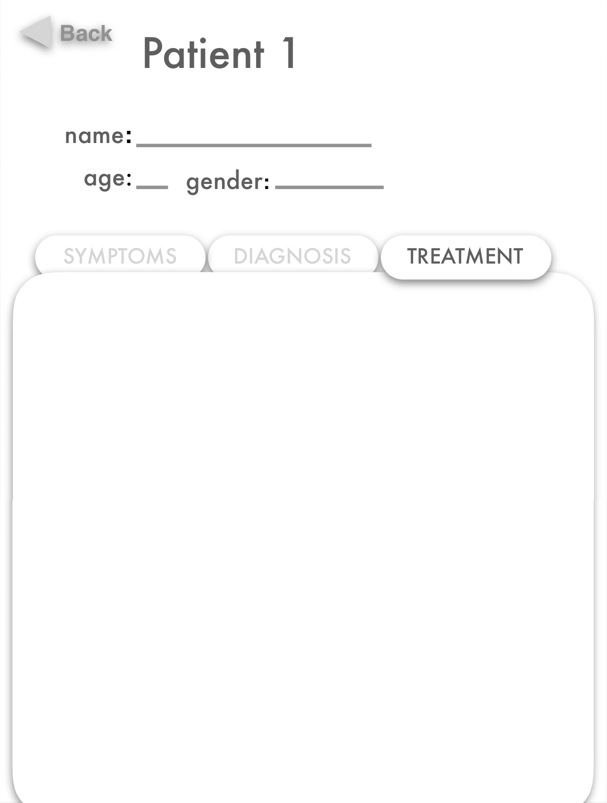
As the tests validated and disproved many initial hypotheses, I continued to iterate the designs. I got rid of the redundant screens and added features (notifications, patient history, personal profile, and settings) that are useful for the Healthcare providers to facilitate patient care.
Branding


App Design Concept
The reason behind the rebrand of the original design is that I envision the logo to bare a refreshing and contemporary look. While keeping the traditional Medical cross symbol, I simplified the shape of the speech bubble and adopted a flat design aesthetic.
Colour Palette
Our complete color palette is comprised of the Mackenzie Vaughan Hospital's colors (orange and purple), with additional colors (white, lavender, and gold). I propose that the additional colors enhance the contrast and add a lively look to the overall design.

